KOREAN CENTER, INC.
– – –
WEB RE-DESIGN & DEVELOPMENT
Korean Center, Inc. (KCI) is a community-based, non-profit organization established in San Francisco in 1974 .
The Korean Center offers a variety of educational classes and cultural workshops and events for youth, adults, and seniors throughout the year. The redesign project was focused on creating a modern looking and easy to use website for the Korean Center community.
I started working at KCI (Korean Center, Inc.) as a web designer, and have also helped them with visual, multimedia design, such as video work, when needed.
ROLES
WEB DESIGN | VISUAL DESIGN | WORDPRESS DEVELOPMENT | MULTIMEDIA DESIGN
WEB DESIGN DETAILS
Problems
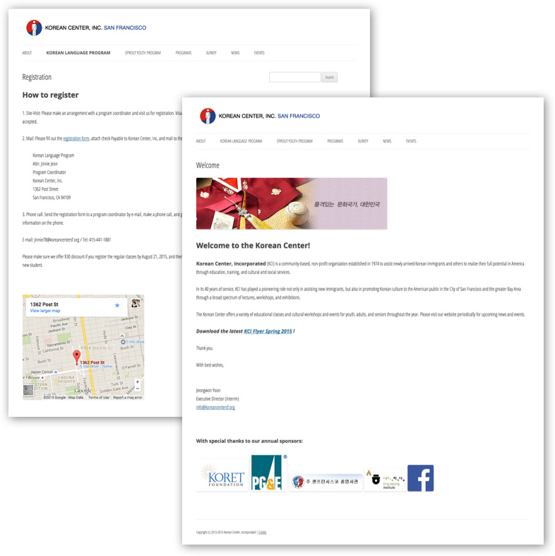
The previous website was very plain and dated, and resembled Microsoft Word, rather than a website. There was a lot of unnecessary content, that was both hard to understand and wasn’t structured particularly well.
Major issues
1. Very plain looking website
2. Lack of focus on different pages
3. Too much textual content, and very little visual imagery
4. Poorly organized website structure
Redesign suggestions
1. Modern responsive website
2. Make the website simple and easy to navigate
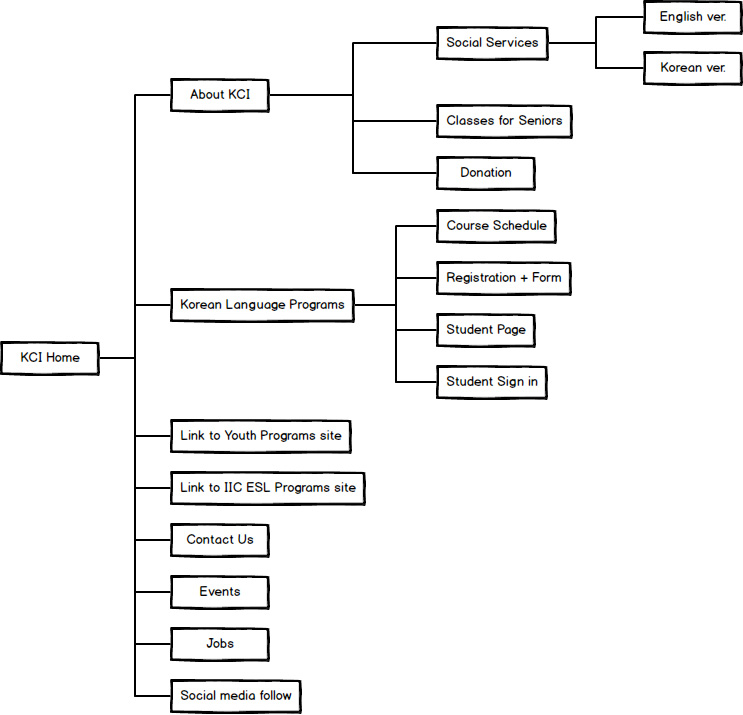
3. Well-organized site structure with necessary content
4. Easy-to-use online registration for education programs
Content Hierarchy
KCI Organizational Structure
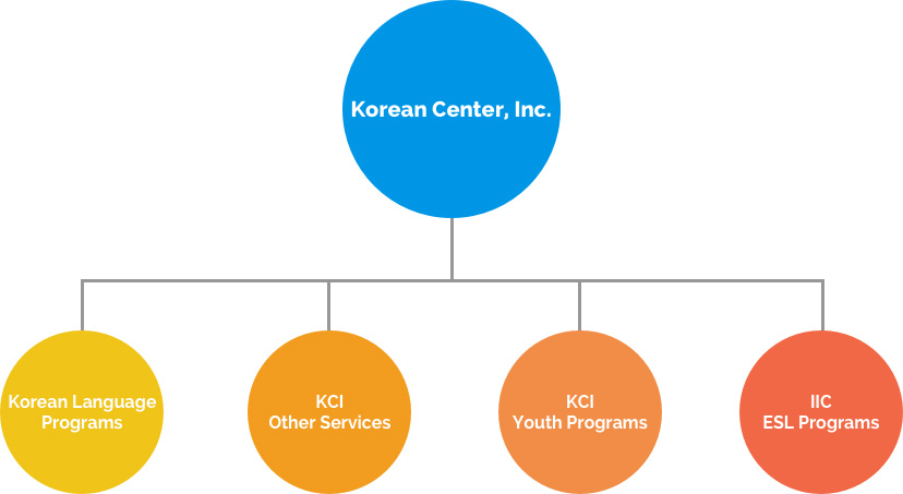
Under Korean Center, Inc. (KCI), there are 4 different programs with educational and social service purposes that form the non-profit organization.
While Korean Language Programs (KLP), and social services use the KCI website, Youth Programs and IIC ESL Programs have their own separate web presence. I was able to simplify what could be seen as a confusing organizational structure, by streaming lining the KCI website and adding external links for the two programs with separate web presence to avoid repeating unnecessary information. This has helped encourage visitors to explore all the programs KCI offers, as well as easily navigate to them.
Site Map
Wireframes
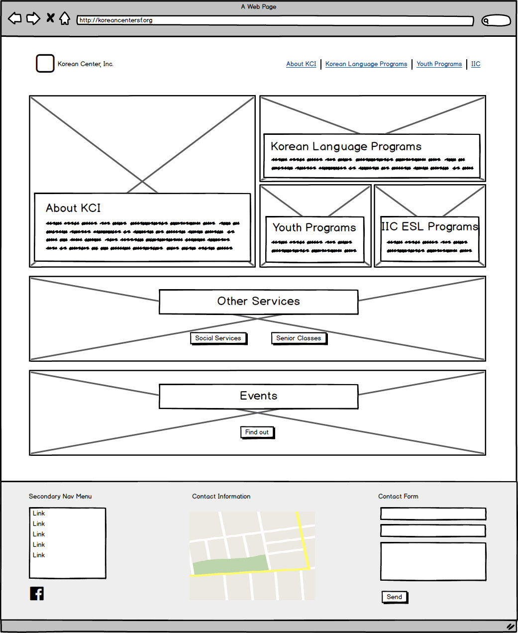
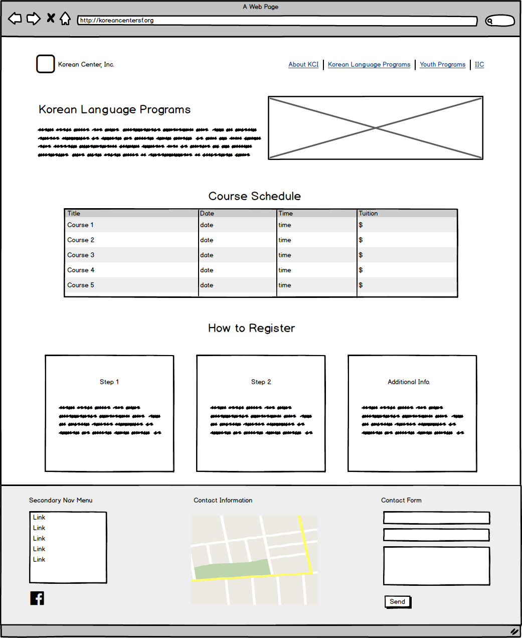

Results

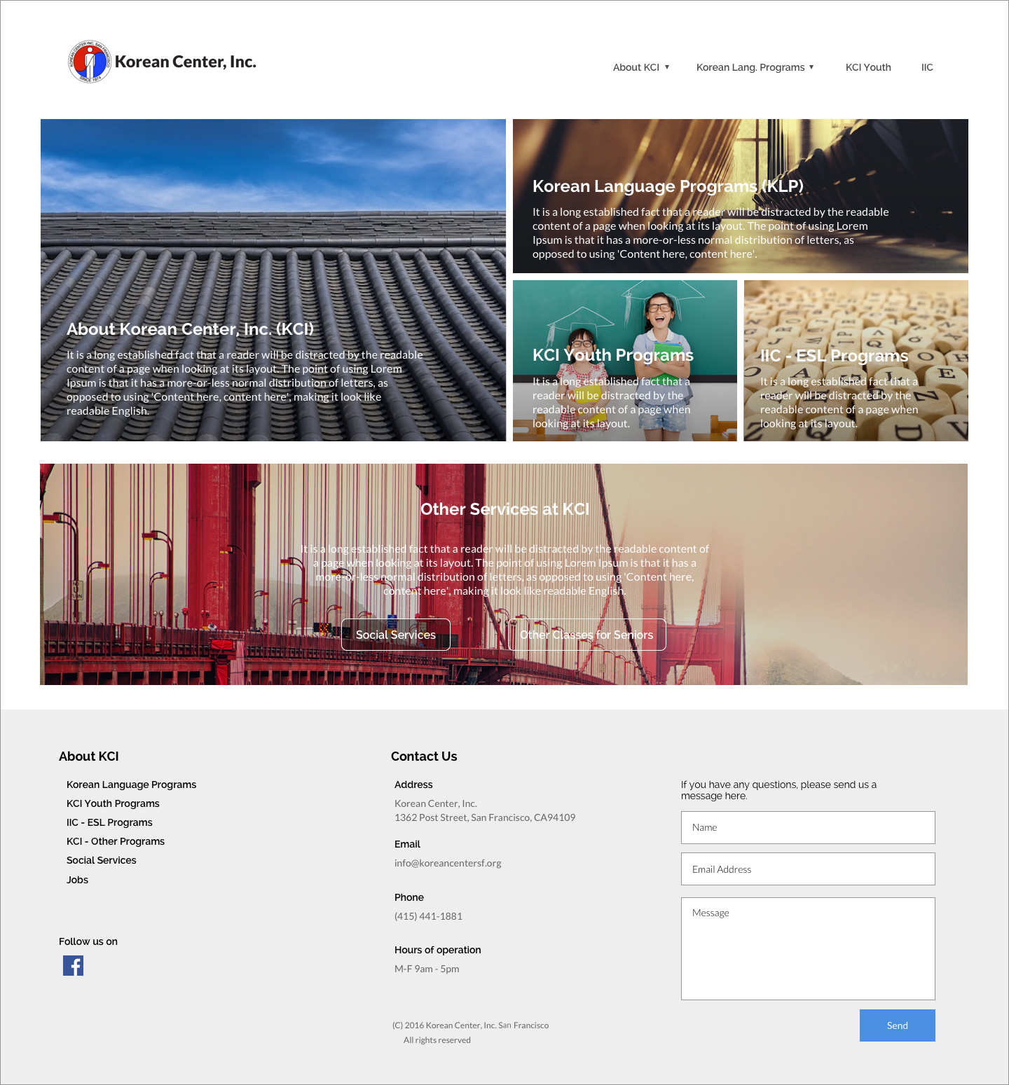
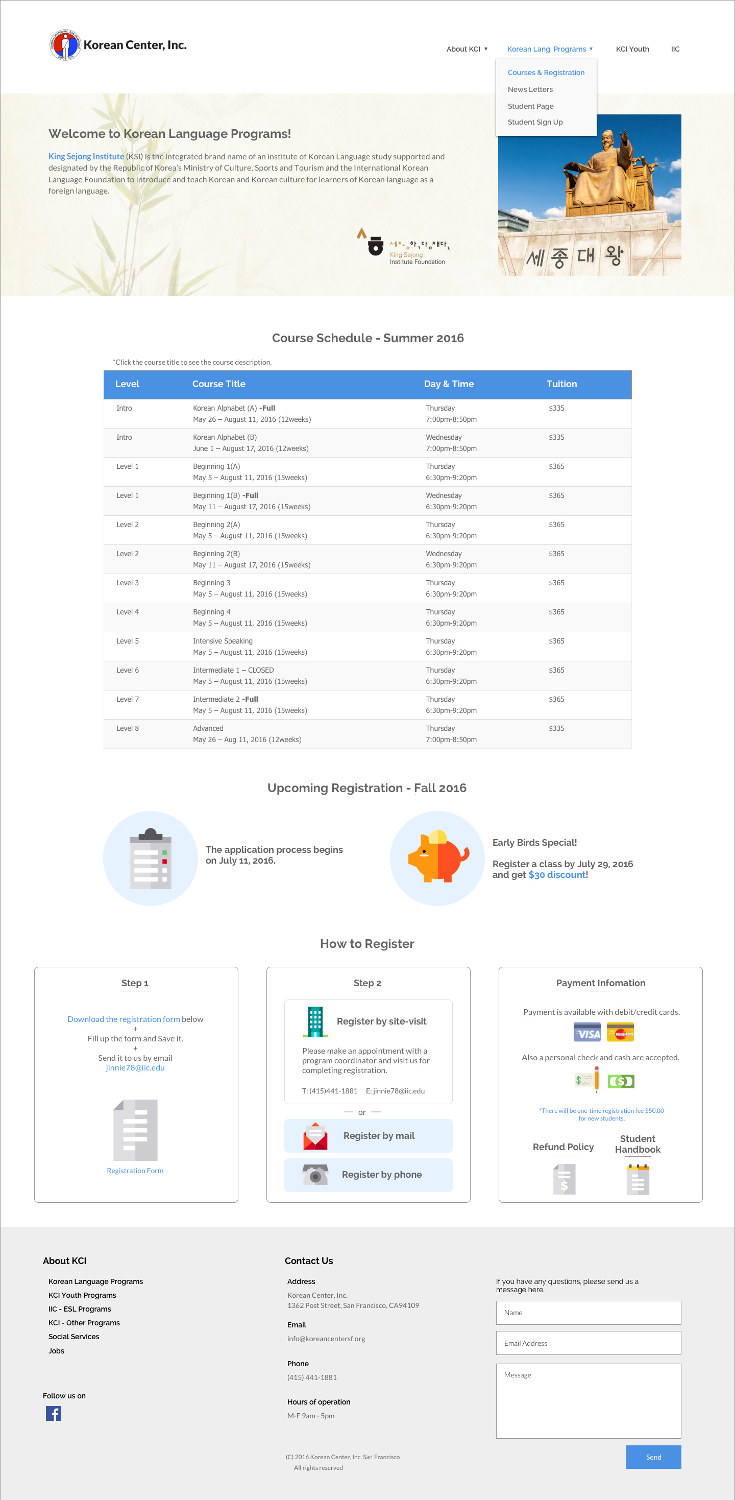
The new homepage was much cleaner than the previous design, has increased the amount of time visitors stay on the website. The navigation menu, in the nav bar, now contains links to the most important content KCI provides; information about their educational programs. The revised footer functions as both a secondary navigation menu as well as an easy place to find contact information and quickly get in-touch with KCI directly via a contact form.
© JI CHOI 2021
