
MARK BELLINGHAM PAINTING
– – –
WEB RE-DESIGN & DEVELOPMENT
Mark Bellingham Painting is a painting business in the SF Bay area that’s been around for over 30 years.
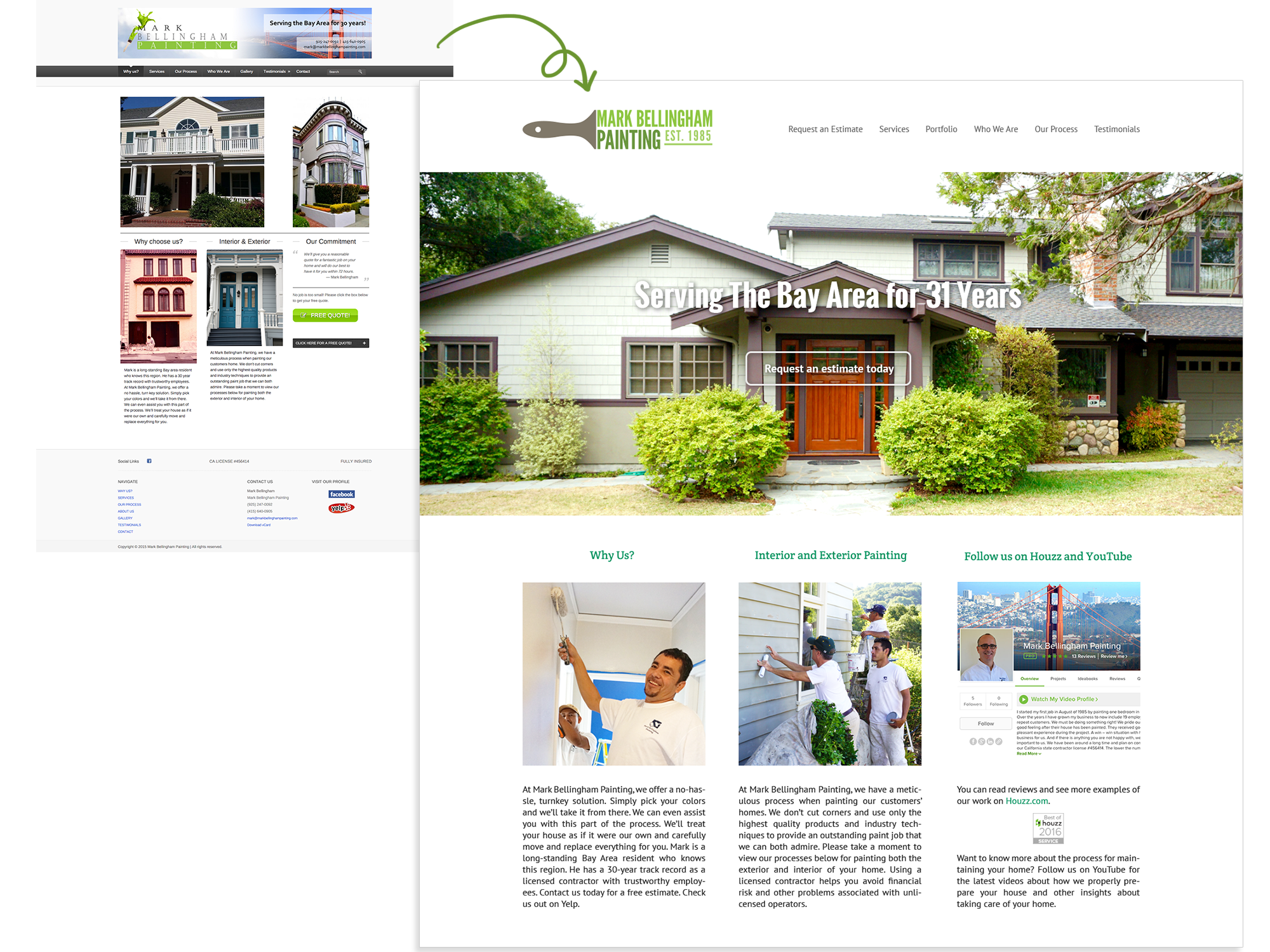
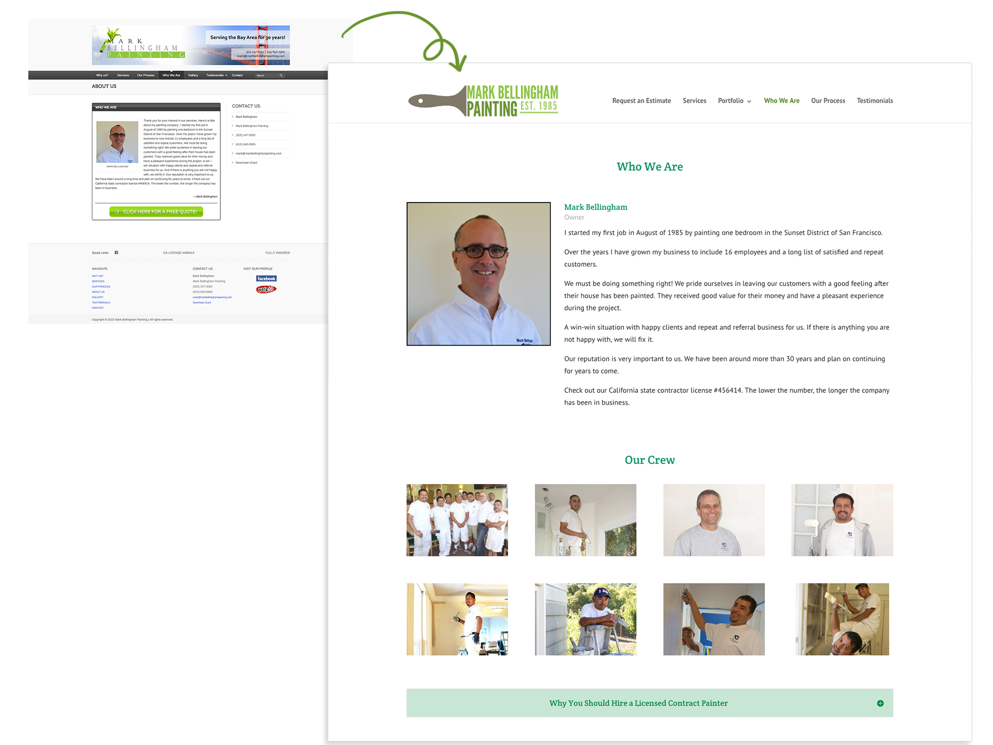
The website redesign project for Mark Bellingham Painting was done by myself and Beth Cataldo, a UX instructor at City College of San Francisco. The key goal for this project was to update their website to make it more modern and appropriate for their clientele. With a professional-looking website, and organized imagery and information, Mark Bellingham Painting could more easily attract customers.
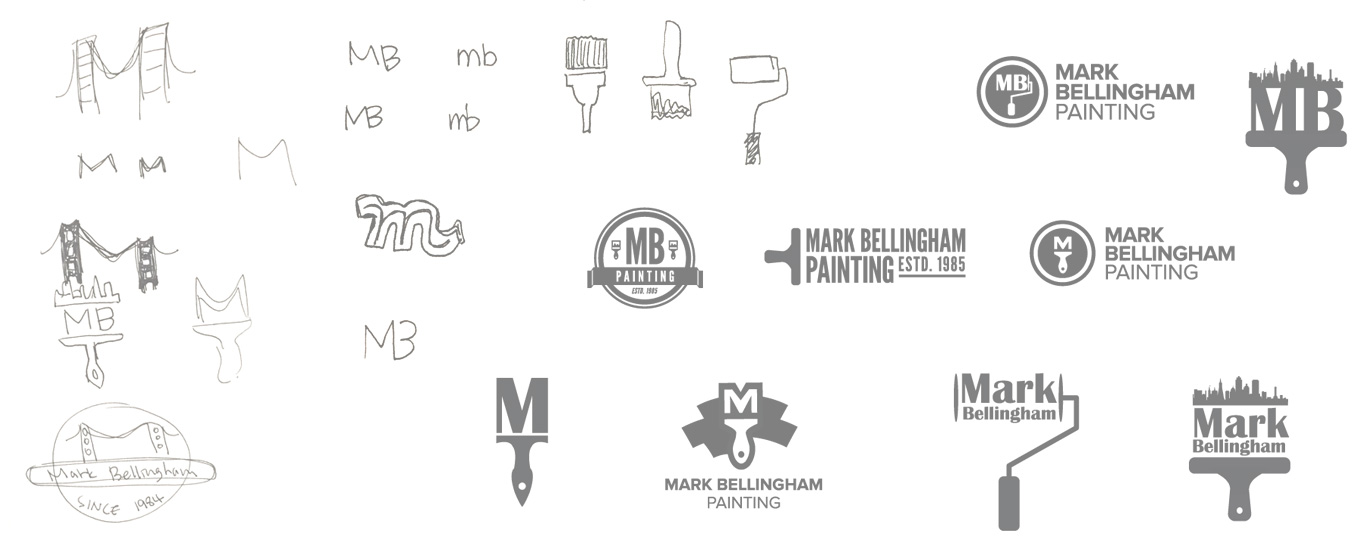

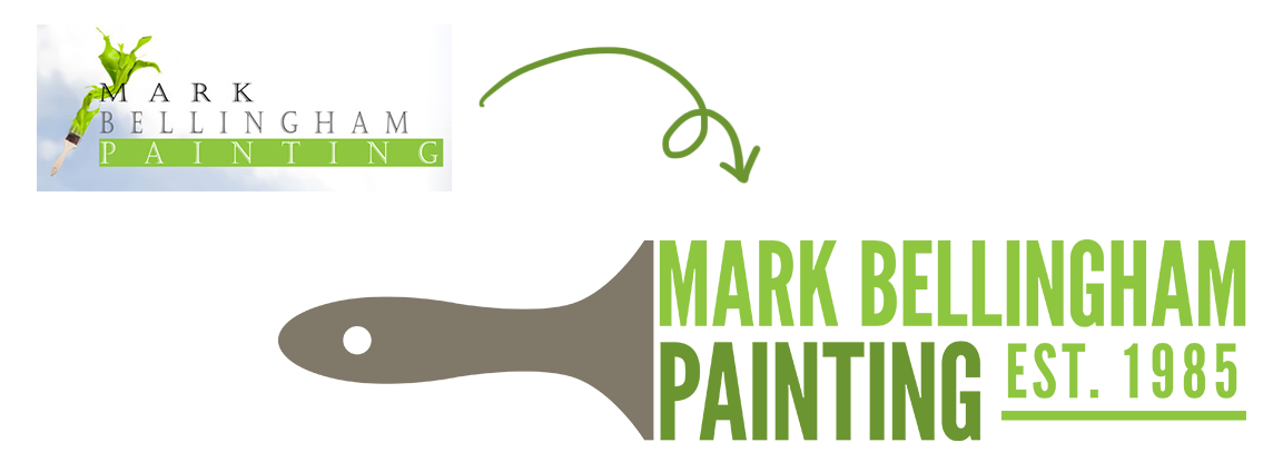
Their previous logo was neither scalable nor easy to work with in different mediums. They wanted a new logo that could be used across their digital presence online and in printed materials.
Mark Bellingham Painting liked the literal design/meaning of a paint brush among the many logo ideas. After many logo iterations they settled on a design that was both modern and practical.
WEB DESIGN PROCESS
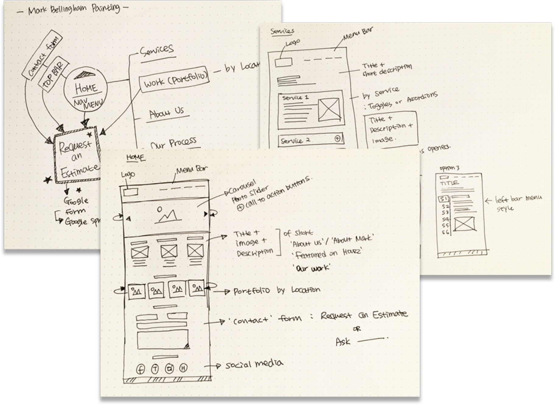
Prior to the redesign, Beth and I discussed the pros and cons of the previous website design. We narrowed down what the major problems were with the design and how to fix them efficiently.
Major problems
1. Out-dated looking website
2. Hard to attract potential customers due to lack of focal points
3. Not enough emphasis on the high quality work Mark Bellinham Painting does
Redesign suggestions
1. A modern, clean, colorful responsive website
2. Use a carousel to surface work imagery and as well as text that links to details and CTA’s (calls-to-action)
3. Make it easy for customers to ask questions and receive estimates
WIREFRAME

OUTCOME
© JI CHOI 2021
